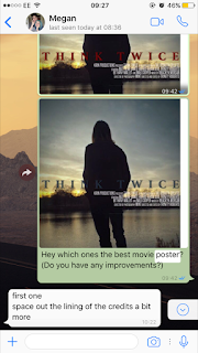

The top image is the film poster that my audience voted as being the best. However, upon looking back on the poster, I realised that the image holds a lot of potential, but my use of fonts and the placement of my writing make the poster look tacky, and nothing to do with my genre. I got the photo and re edited it on BeFunky, adding filters and vignette on the image, as well as increasing the brightness and contrast. This gave me an image that looks slightly dark and mysterious, as the figure in the image is looking away from the camera still, hiding his identity (which links to my narrative). I changed the placement of the title and credits to be in the centre of the image, as this opened up both the top and the bottom. It also makes my poster look unique, as this isn't a typically convention for movie posters. I tried out three different colours that suit both the narrative and the genre, to see what they each look like. With this, I will get audience feedback on what one stands out the most.
Audience Feedback:
I also tried out the idea suggested to me, and came up with a new poster design. So now, I am going to ask the see people which one they prefer out of the most popular one and the improved version.


No comments:
Post a Comment