Friday, 28 April 2017
Sunday, 16 April 2017
Saturday, 15 April 2017
Friday, 14 April 2017
Monday, 10 April 2017
Friday, 7 April 2017
Friday, 10 March 2017
Music and Voice overs
Whilst creating my trailer for Think Twice, I came across audio problems from certain clips, like the screenshot features below with the taxi scene. To overcome this, I had to get my actors back and re recorder what they said in time with the clips, using a SnowFlake Recording device. This made the speech more clear and dramatic against the music I chose. With having the audio detached from the clip, I was also able to place separate shots over the audio, as well as the original clip where the actor is talking, to create more dimension.

Below is a screenshot of the point in my trailer where the music changes, which is after the inserted black background. I added a different type of music so that my trailer goes more upbeat and dramatic, as the continous piano soundtrack wasn't creating that element of tension that I need for my trailer to really have that thriller affect.

Tuesday, 7 March 2017
Monday, 6 March 2017
RATING FOR MOVIE TRAILER


When researching the rating screen for the start of my movie trailer, I found that the appropriate one for my trailer would be the red one, as it will fit more with my genre of Psychological Thriller, as that will tell the audience about that potential graphic content and adult themes in my trailer, which is correct for my target audience which is above 18 years of age. I then created my own one:

I used my company name in the rating screen instead of the one used on the above, and I changed the web address
Final Magazine Drafts
Additional Final Magazine covers improved:
Feedback:
After getting teacher feedback, I had to make improvements to my magazine cover in terms of font and colour scheme. Below are my two finale magazine covers. The masthead has been changed to a font called lemon milk, as it makes it stand out more and is more conventional for a magazine cover. The colour has also changed, as my magazine needed a brighter colour to stand out against the black and white image, that would also go with the light blue and yellow. I have also moved the layout around, to make it look more professional.
Friday, 17 February 2017
Friday, 10 February 2017
Billboard Poster

I took a look at a range of different billboard posters from different genres in order to find inspiration for my own billboard poster. What each poster does is have the movie title in bold, to make it stand out This is done so that the target audience, who may be travelling past, can quickly glance at the poster and know the name straight away. They also include their main characters, as it is the actors that will attract the audience to watch the movie.
I gathered photos from my draft photoshoot and placed them against a grey background. I included the information needed for my movie, such as the title, slogan, actor names and credits. I made Lopez stand out against the rest of the characters, as she is the one investigating them and trying to get to the bottom of what is going on.
Friday, 3 February 2017
Final Poster: Drafts


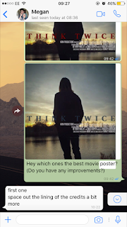
The top image is the film poster that my audience voted as being the best. However, upon looking back on the poster, I realised that the image holds a lot of potential, but my use of fonts and the placement of my writing make the poster look tacky, and nothing to do with my genre. I got the photo and re edited it on BeFunky, adding filters and vignette on the image, as well as increasing the brightness and contrast. This gave me an image that looks slightly dark and mysterious, as the figure in the image is looking away from the camera still, hiding his identity (which links to my narrative). I changed the placement of the title and credits to be in the centre of the image, as this opened up both the top and the bottom. It also makes my poster look unique, as this isn't a typically convention for movie posters. I tried out three different colours that suit both the narrative and the genre, to see what they each look like. With this, I will get audience feedback on what one stands out the most.
Audience Feedback:
I also tried out the idea suggested to me, and came up with a new poster design. So now, I am going to ask the see people which one they prefer out of the most popular one and the improved version.


Friday, 27 January 2017
Intertitle Examples

I picked four different movies to look at their intertities for inspiration for my own trailer; Gone Girl, Split, Black Swan and The Machinist. For Gone Girl, I like how the name of the actor is put over a clip of him, as then you know directly who the actor is. I also like how the use of the black swan weathers under the inter titles for black swan, as it fits to the theme of the trailer and shows the importance of it. It also makes the trailer very unique as it is a personal aspect of the trailer that is not bound to be repeated in another. For Split, the inter titles are classically placed over a black background, used to make the writing stand out more and place full attention to it. For the Machinist, the intertitle with the actors name on is very small against the clip, which I find interesting as it doesn't make it the main importance in the clip, whereas with the other three the writing is. For my trailer, I will attempt these different approaches to showing information in my trailer.
my go:


More intertitle research for credits and release dates
Examples:


Mine for Think Twice:


Subscribe to:
Comments (Atom)


